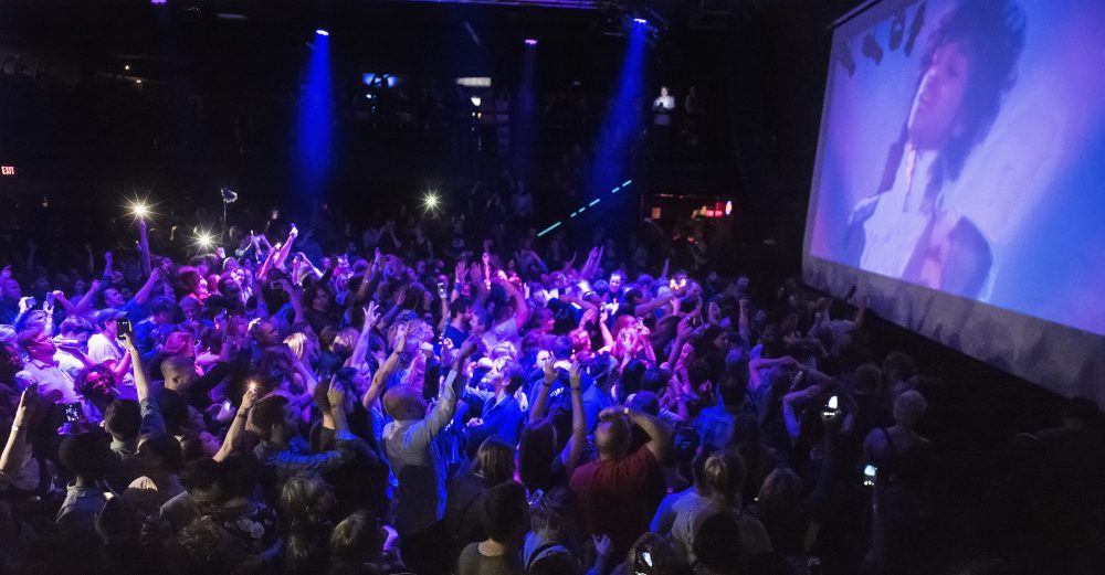
The rain on a Friday evening did not seem to hinder students, alumni and instructors from coming to campus for the head to head competition of eight graphic design arts students.
“I was definitely impressed by the turnout,” said Joe Bautista of the more than 70 people in attendance, an instructor at CSUN who presented the idea for the competition to students and other instructors. “Usually rain causes people to not want to go out. But I think the event itself was so unique, there’s that competitive factor to it and you want to see who is a great designer or artist and that made the turnout a success.”
For the first time at CSUN, a competition called “You vs. Who?” took place at the Art and Design center’s Purple Crit room Friday evening. This competition was an impromptu digital design tournament and the idea was taken from the nationwide competition “Cut and Paste” which is held in Los Angeles, New York City and San Francisco.
“For most of us it’s our senior year and we’re the guinea pigs,” Marge Yang said . There were a total of four computers set up in the room. Two computers were on the right side and two on the left. Two screens on each side showed images on the wall for the audience to see the contestants’ process. Four of the contestants were randomly chosen on the first round. The second round included the remaining contestants.
The main objective is to outdo the person sitting next to you in creativity and execution. Each round a winner is chosen from each side.
The third round will have the last four contestants remaining and would eliminate two players. But the fourth and final round, would have the last two contestants competing not only for bragging rights but for $200.
The eight competitors were William “Why Can’t We Be Friends” Ortiz, Sean “Seancifer” Ruge, Max “PlasticSpider” Shuster, Theresa “The Prez” Sheldon, Marge “Margelous” Yang, Mark “Cheddar” Major, Joe “Jotarobot” Olorga, and Luis “The Tiger” Andrade.
Each competitor was e-mailed the seven possible topics to be presented at the competition. This was to provide for each student to have enough time to be ready and aware of the possibilities they can conceptualize, but not too much time.
“I didn’t tell them the topics too far ahead of time,” Bautista said. “But to get it that day on a fly would have been too much of a challenge. It was fair to give them the concepts Wednesday night.”
The topics were broad enough to draw out variety and individualism. The seven topics included “Truth, icon worship,” “So good it hurts,” “Egocentric,” “Everything in its right place,” and “In the event of an emergency.”
As Yang and Sheldon took the left side and Major and Olorga sat on the right side, anticipation took over. The room filled with an audience who snacked on refreshments sat or stood close together.
“The topic (for the first round) is ‘I feel pretty’,” Bautista said in a commanding voice. “Your 20 minutes starts now.”
Music lifted the mood of the audience as some danced and others carefully scrutinized the process each designer was about to take.
The concentration of the four contestants intensified but laughter broke out in the crowd with cheers after the notorious picture of Britney Spears voluntarily shaving her head was portrayed on the wall by Sheldon.
The twenty minutes were up and deliberation about the four designs began. Judges felt Olorga’s work had complete composition, the type face for the text worked well with the image and the aesthetics were self-created.
Yang was chosen for the other side of the room. Yang presented a cartoon-like girl who was carrying flowers designed to look like Dippin’ Dots.
“It reminds me of the Japanese style,” said one of the judges. “I like the understated typography and I like the style of illustration.”
As the winners for the first round stepped aside, the contestants for the second round took their seats. Andrade and Ortiz sat at the left side of the room as Ruge and Shuster took the right .
The topic was “Everything in its right place.” Because this was an impromptu event, the students were allowed to have the audience involved in their design by taking photos of them.
Andrade asked a faculty member in the audience to place his green shoes on the wrong feet and took a close up of his legs and typed “Jung walks funny” in a rich, orange colored font. Ortiz began creating the look of the Tetris game on his screen by exacting black outlined boxes and a score board on the side.
Shuster took a photograph of architecture and began to substitute the image of the building with his own colored-blocks and Ruge photographed the palm of his hand and wrote “I have the power!!!” along with brush strokes he created in the background.
A few of the contestants finished before the 20 minute time was up and they began to have an AIM-like conversational battle as they commented on who’s work was better and brought humor and lightness to the dark-lit room. But all jokes were put aside when time was up and the winners were called by the judges.
“I loved watching the process in all of these,” said Jim Kelley, one of the judges and a faculty member at CSUN. But when it came to choosing just one from each side, critiques were provided from all judges.
“I’m not sure it solves the problem,” said a graphic designer from Meat and Potatoes, a Southern California based design company, referring to the photographed hand. “But the process was amazing to watch. I have to go with Max.” The three judges picked Andrade’s design.
“He won because he used my shoes,” Jung Hong, a faculty member said jokingly.
For the final four contestants, the theme was “iconic worship.”
Luis won for his straightforward message of photographs of one man lifting his hands to one of the judges, Kelley, in a meditative pose. But Olorga’s concept caused gasps in the audience.
“The ideas were all pretty clever but Joe (Olorga) has the ability to illustrate using the computer and mouse,” said Bautista. “His iconic worship was just a brilliant concept.”
Olorga created a simple design on the desktop without any other program. With the desktop icons he created a 3-D cross with a yellow background that resembled rays of light.
With two contestants left, Andrade and Olorga, the last round theme was “inconvenient truth.”
Audiences saw Andrade rush out of the room and come back with a photograph. It picture was of a couple layers of toilet paper smudged with a brown colored smear and a chunk of brown matter next to it.
Responses of laughter and disgusted moans resonated throughout the room while Olorga was focusing on a darker image of red buildings.
After the last 20 minutes of the evening was up, the long awaited announcement of the impromptu event winner was announced. Andrade moved to Olorga’s side and sat next to him.
Audiences applauded for the 2007 winner for the first impromptu digital design tournament at CSUN, Joe Olorga whose nickname is JotaRobot. His speech was simple and short.
“Shots for everyone,” said Olorga.
“I think the winner could have easily been knocked out for the first round,” said Bautista. “It was pretty much anyone’s game at the beginning. What’s great about it this is everyone had a different style and technique. You have to look beyond that and get the concept.”
The eight contestants volunteered but went through a weeding out process from having their previous worked looked at to see if they were fit for this competition. All contestants received an iTunes gift card provided by Apple, the runner up received $100 and the winner $200.
Almost all the contestants were surprised and the turnout of the evening and have confidence that the following years will have a larger turnout.
