


The Daily Sundial rolls out a new online look
August 19, 2020
Last night we launched our new digital logo, as we begin to refresh our look in general. While our old look did its job, we decided a change was needed.
Our previous logo rolled out during the fall 2014 semester and has remained our logo since then. It was unique as it displayed a literal sundial off of the letter “L.” The bold serif font was bubbly and fun, however, its appeal did not stand the test of time.

The name “Daily Sundial” provides a more accurate picture of the work we do online. We deliver daily online news to the CSUN community, so we decided it was time for this to be represented in our name plate.


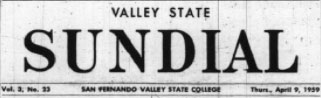
We are going back to our roots and using the same strong sans serif font we used in 1959, two years after 0ur publication was founded and when CSUN was still known as San Fernando Valley State College.
The return to our past logo is a nod to the long lineage of dedicated Sundial journalists who have delivered quality journalism to our community. We hope this change is a lasting reminder to the CSUN community of our promise — to provide you the information you need daily.
The pandemic has pushed most of our student body to work from home, leaving our campus virtually empty. This is a blow to the Daily Sundial, as we distribute our weekly print edition via newsstands throughout campus. Since there will be fewer people on campus to pick up our paper, we have decided to suspend production of our print edition this fall. All of our content will be published on our website.
Over the next few months, you will begin to see some changes to our website and overall branding that represent a shift to a refreshed, yet traditional publication.