


5 Elements For A Perfect ‘Hero Section’ On Your Website
Branded Content by Cosmic Press
The hero section of a website is the first thing that visitors are presented with after a website loads. Occupying a prime location, often right below the logo and main menu, this section plays an outsized role when it comes to setting the tone of a webpage, while attracting attention, and compelling action.
Even subtle changes and variations in the ‘hero section’ can leave a drastic impact on the overall conversions, engagement, and lead generation. As a result, website owners and marketers are leaving no-stone unturned, when it comes to acing this section.
As with most things pertaining to web design and conversion rate optimization, getting the hero section right is an art, just as much as it is a science. While it takes years of practice, trial and error to get it right, in this article, we lay out a few key elements and best practices for a perfect ‘hero section.’
1.Clear & Concise Headlines
The headline is the most crucial element of the section, that quickly conveys the topic, intent, or nature of the webpage. Given the fickle nature of website visitors, it should ideally cut to the chase right away, and convey the core value proposition without any delay.
Top performing headlines are usually not more than 10 to 12 words, are located prominently within the section, with a color and font that helps them stand out from other surrounding content. The key here is to convey all visitors need to know about your product, service or website, as quickly as you possibly can.
2. Compelling Subheading
Given the limits to how much can be conveyed with a header alone, we require a subheader to add more context. Ideally located right below the main header, with minor variations in the font and color, the subheader should aim at keeping the engagement alive, and compel visitors to scroll further.
If the goal of the headline is to grab attention, for the subheader it is to draw them in deeper. Here again, there is a right length, information, and level of persuasion to perfectly strike a chord with readers, and is something that can only be figured out with extensive testing and optimization.
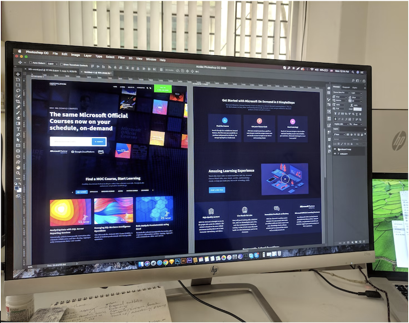
3. High-Quality Image / Video
Most high-performing ‘hero sections’ feature a stunning visual as a backdrop to their header, subheader, and other elements. Often a high-quality stock image, a video footage, or even an illustration, the background should help accentuate other elements while setting the broader tone of the landing page.
The background need not be directly relevant to the niche or topic of the site either, it only has to resonate with the audience, and their state of mind. For example, an ocean stock footage can do wonders to a brand selling t-shirts and dresses, in addition to its natural appeal for vacationers and travel aficionados.
There is no shortage of either high quality stock images or videos, and illustrations, if anything the only challenge here is identifying the diamond in a haystack, that perfectly aligns with your site, niche, audience, and broader content.
4. Social Proof
Beyond grabbing and retaining attention, the hero section also helps in projecting attributes of quality, authority, and professionalism. This can be done by subtly including various social proofs, or reviews and testimonials you’ve accumulated over the years.
Most brands simply include a TrustPilot badge in this section, clearly mentioning the ‘5 Stars’ and ‘Verified.’ The same can be done with Google Local Business Reviews, Yelp, and even Facebook.
This can be taken up a notch by including screenshots of tweets, Facebook posts, and comments pertaining to the brand or product. The inclusion of such elements are known to substantially improve conversions and engagement almost immediately.

5. Responsiveness
A vast majority of internet users, over 92% of them use their smartphones to surf the internet at some point each day, and mobile phones now account for nearly 60% of the global web traffic. With figures like this, mobile traffic cannot be ignored, making responsiveness a key element in web design.
No matter how stunning and exquisite the hero section is, it doesn’t add much value if half the traffic it receives is unable to view it properly.
As a result, it is absolutely crucial to ensure the section looks just as attractive on smaller screens, and the elements in it are responsive enough to adapt to changes in screen sizes. Most themes and templates already come with responsiveness built into them, but if the hero section includes extensive visuals and effects, they may not always perform well on smaller screens.
Final Words
On the internet, user heuristics always favor visually appealing content over one that fails to impress or standout. When it comes to trust, reliability, and authority, most users still fail to comprehend the renowned adage “all that glitters is not gold.”
This makes it absolutely crucial to have a polished first impression, and the ‘hero section’ in web designs has since emerged as the answer.
Branded content furnished by our promotional partners. The Daily Sundial editorial staff is not involved in its production. Content does not reflect the views or opinions of the editorial staff.