>>> CORRECTION: The 911 Campaign has yet to take place. CSUN PD will be launching this campaign later this semester.
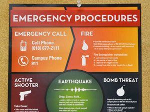
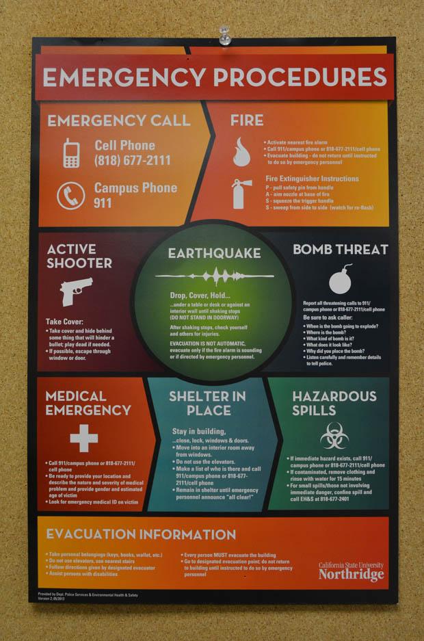
CSUN Police is distributing new emergency placards throughout campus that will list the recommended protocol in case of a fire, earthquake or an active shooter.
PD has also been visiting different departments on campus to remind them of the recommended procedures in case of an emergency.
“(The placard) is a great improvement,” said Crystal Hernandez, a junior biology major. “It’s easy to read, understand, and it’s concise. We need this because of recent events of shootings and bombings.”
The previous posters were flipcharts and a person was required to flip through many pages to find instructions of what to do. The information was hard to read due to the small print, wording, and spacing.
Due to the chart’s inefficiency, a poster was made. It was an improvement with more accessible instructions.
“In an emergency, no one is going to worry about flipping a chart. You have to get to an emergency immediately,” said Kit Espinosa, emergency preparedness coordinator. “This is short, sweet, and to the point.”
The newly redesigned poster was designed by VISCOM (Visual Communication) students.
They are CSUN students that provide creative services that solve problems on and off campus through innovative designs.
They wanted to improve it because of the importance of the information and the unfortunate events of shootings.
The students made their pitch to CSUN PD to redesign the poster to make it efficient, more accessible, easy to read, understandable and inviting.
“It [the previous poster] was badly designed but it had a good intention,” said Dave Moon, director and professor of art. “We wanted to improve it. We wanted better access, navigation and flow.”
Students presented their designs to Espinosa. After one was chosen, the class improved the design.
“We wanted an infographic direction. It does a good job presenting complex information,” said Pedro Ramos, senior art major. “The past poster was all over the place. There was no focus to it. This is clean, attractive, and informative.”
